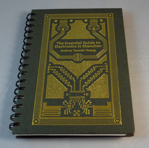
The crowd funding campaign for The Essential Guide to Electronics in Shenzhen is about to wrap up in a couple of days.
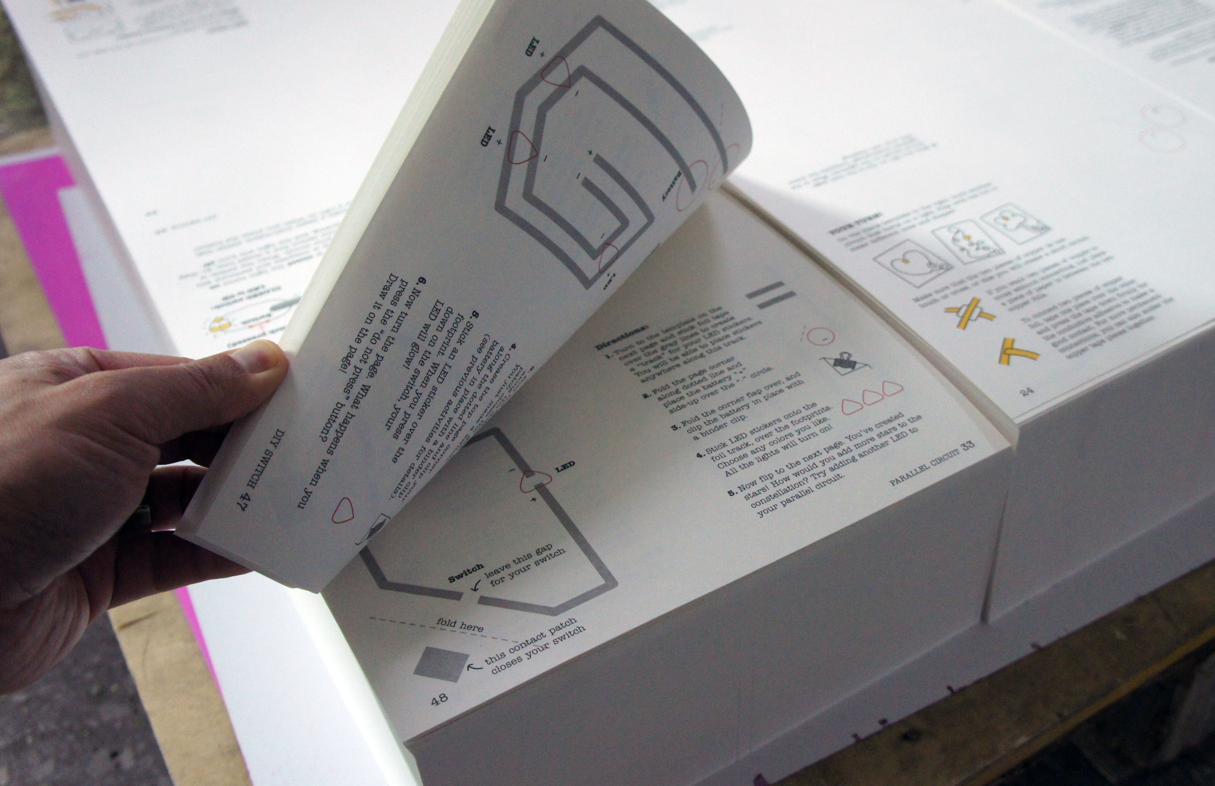
I’ve already started the process of preparing the printing factory for production. Last week, I made another visit to the facility, to discuss production forecasts, lead time and review the latest iteration of the book’s prototype. It’s getting pretty close. I’m now using a heavy, laminated cardstock for the tabbed section dividers to improve their durability. The improved tabs pushes up the cost of the book, and more significantly, pushes the shipping weight of the book over 16 oz, which means I’m now paying a higher rate for postage. However, this is mostly offset by the higher print volume, so I can mitigate the unexpected extra costs.
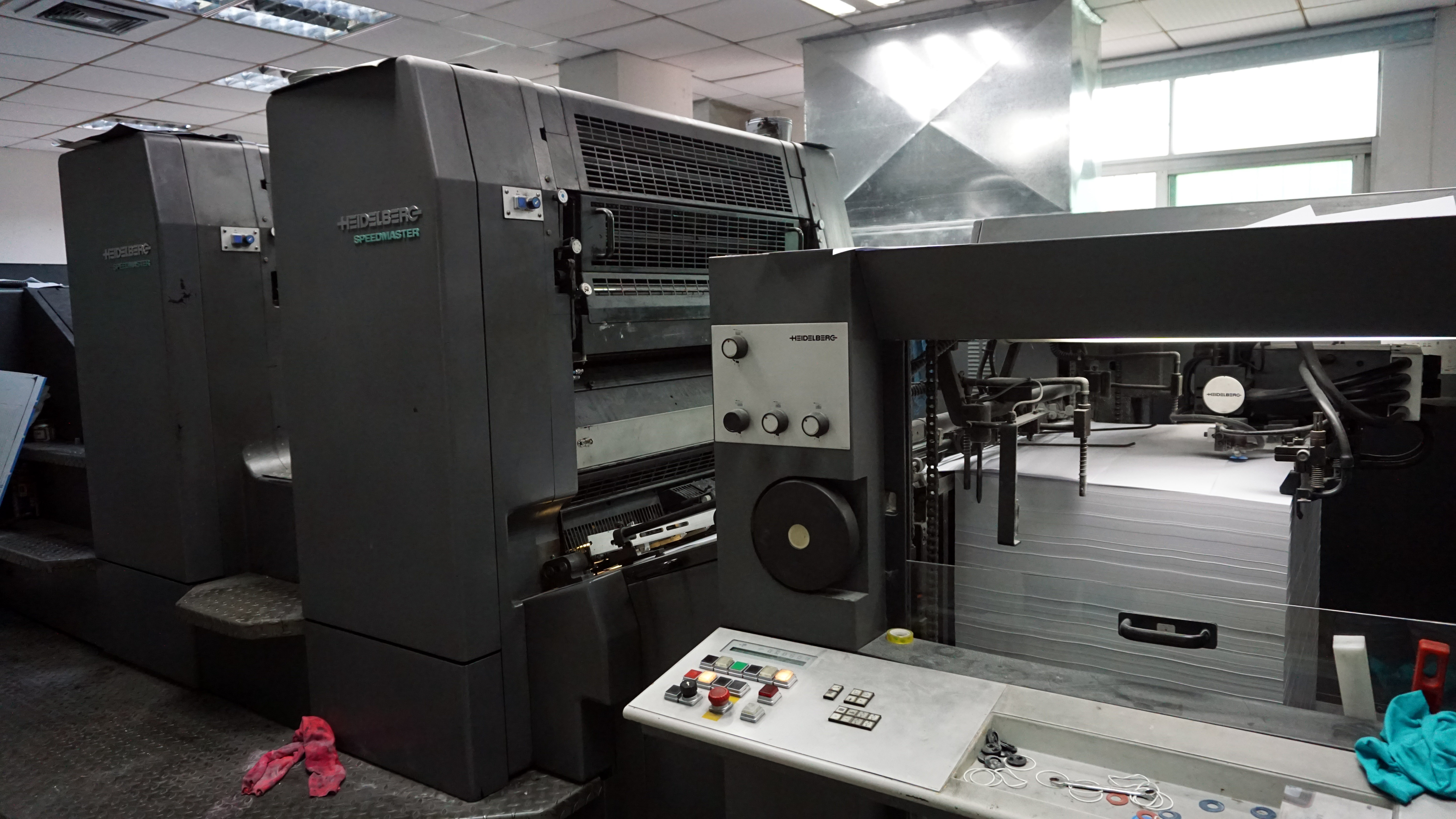
The printing factory has a lot of mesmerizing machines running on the floor, like this automatic cover binder for perfect-bound books:
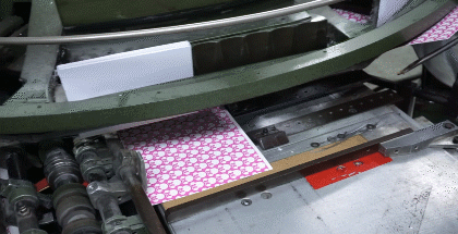
And this high speed two-color printing press:
This is probably the very press that the book will be printed on. The paper moves so fast that it’s just a blur as an animated gif. I estimate it does about 150 pages per minute, and each page is about a meter across, which gives it an effective throughput of over a thousand book-sized pages per minute. Even for a run of a couple thousand books, this machine would only print for about 15 minutes before it has to stop for a printing plate swap, an operation which takes a few minutes to complete. This explains why books don’t get really cheap until the volume reaches tens of thousands of copies.
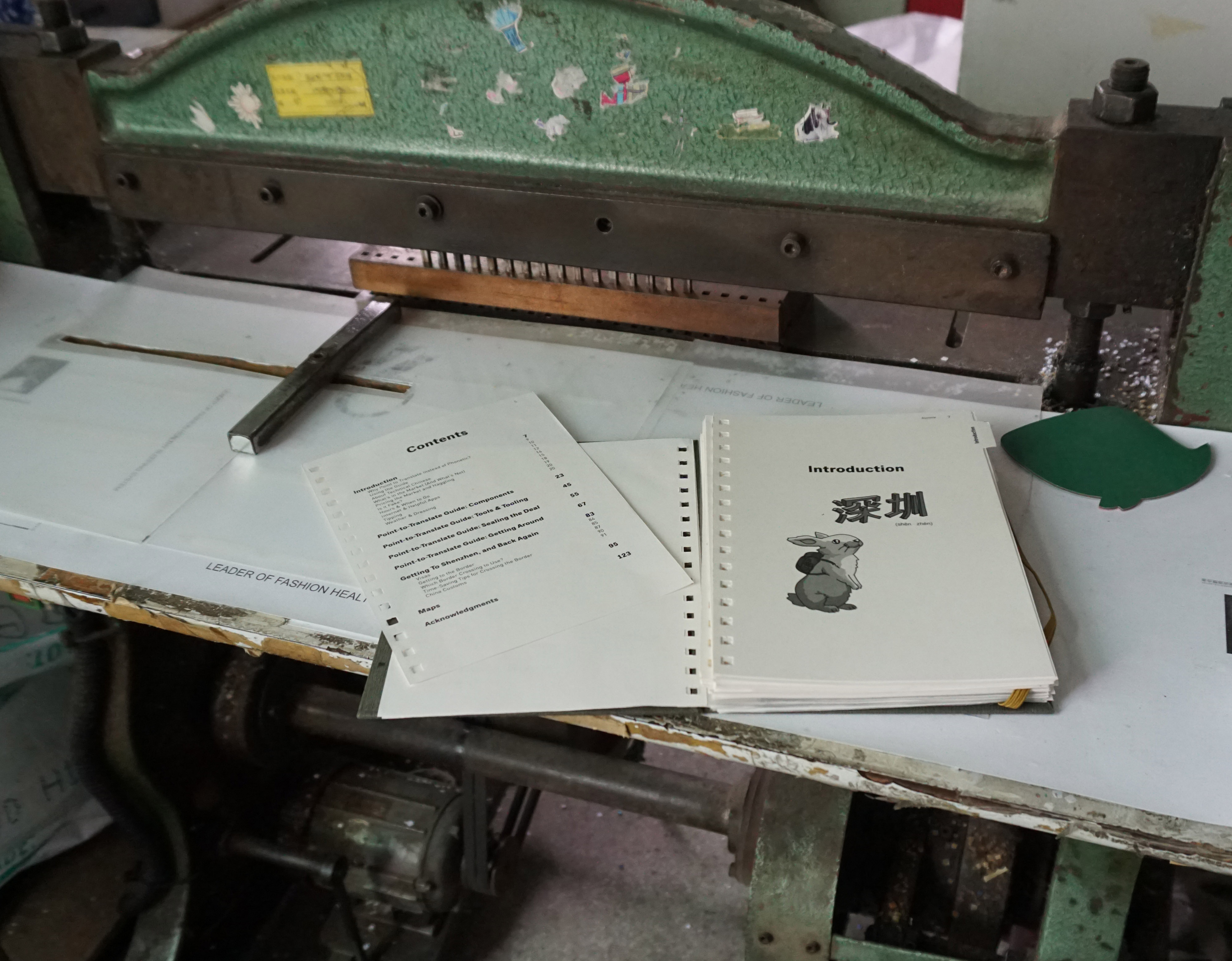
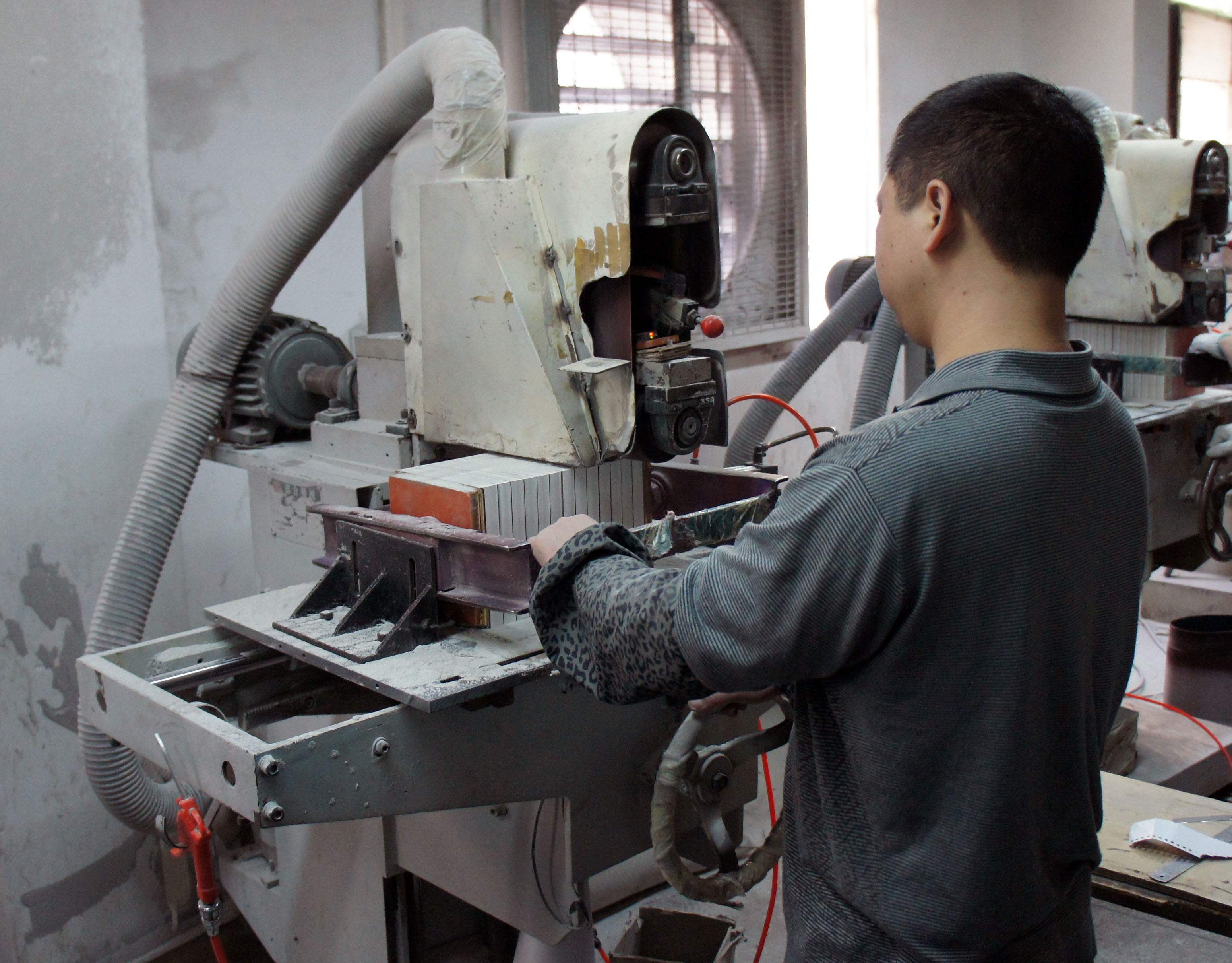
Above is the holepunch used for building prototypes of ring-bound books. The production punch is done using a semi-automated high-volume die-cutter, but for the test prints, this is the machine used to punch out the holes.
The ring binding itself is done by a fairly simple machine. The video above shows the process used to adjust the machine’s height for a single shot on the prototype book. In a production scenario, there would be a few workers on the table to the left of the binding machine aligning pages, adding the covers, and inserting the ring stock. Contrast this to the fully automated perfect binding machine shown at the top of this post — ring binding is a much more expensive binding style in this factory, since they haven’t automated the process (yet).
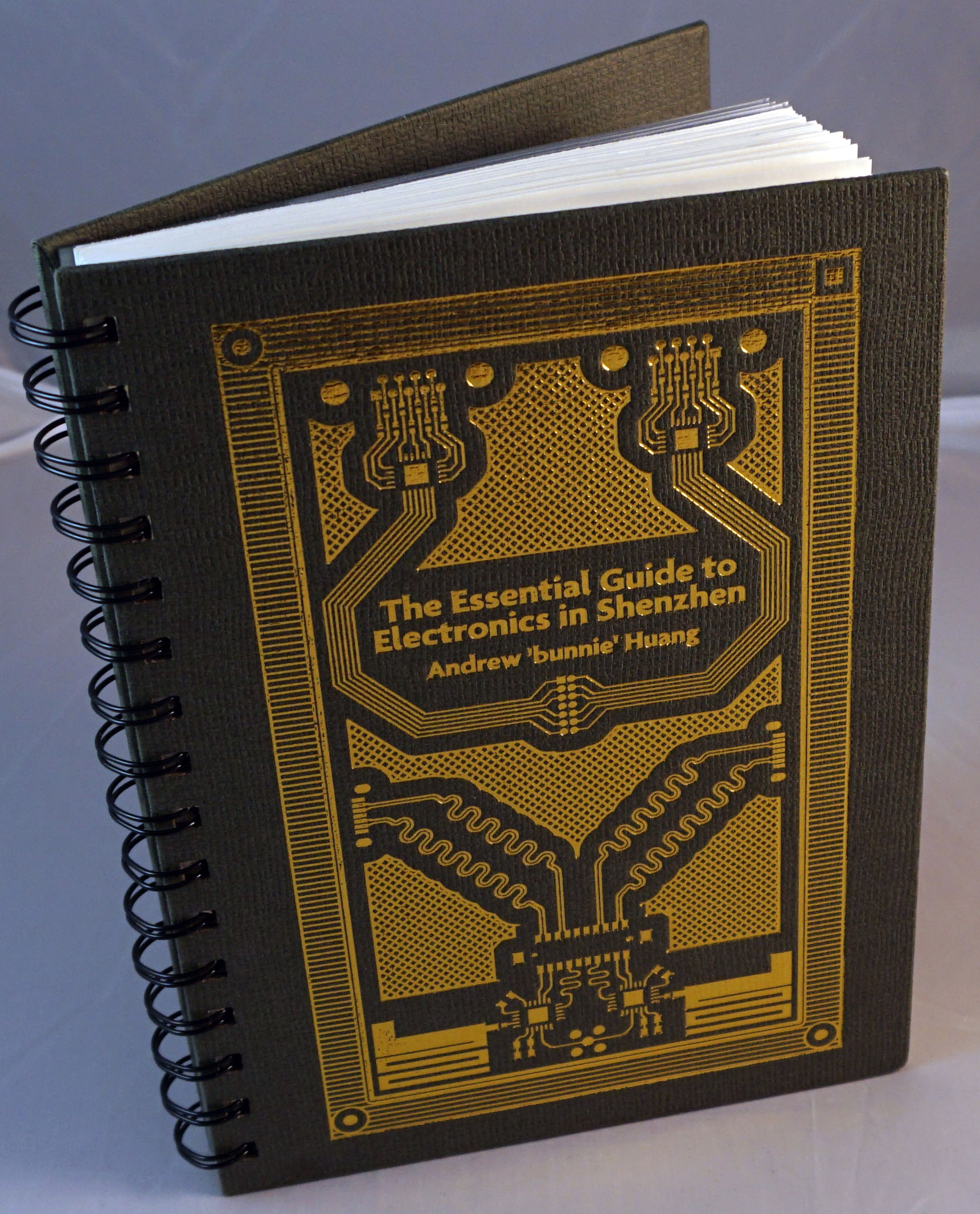
I also got a chance to see the machine that gilds and debosses the book cover. It’s a bit of a different process than the edge-gilding I described in the previous post about designing the cover.
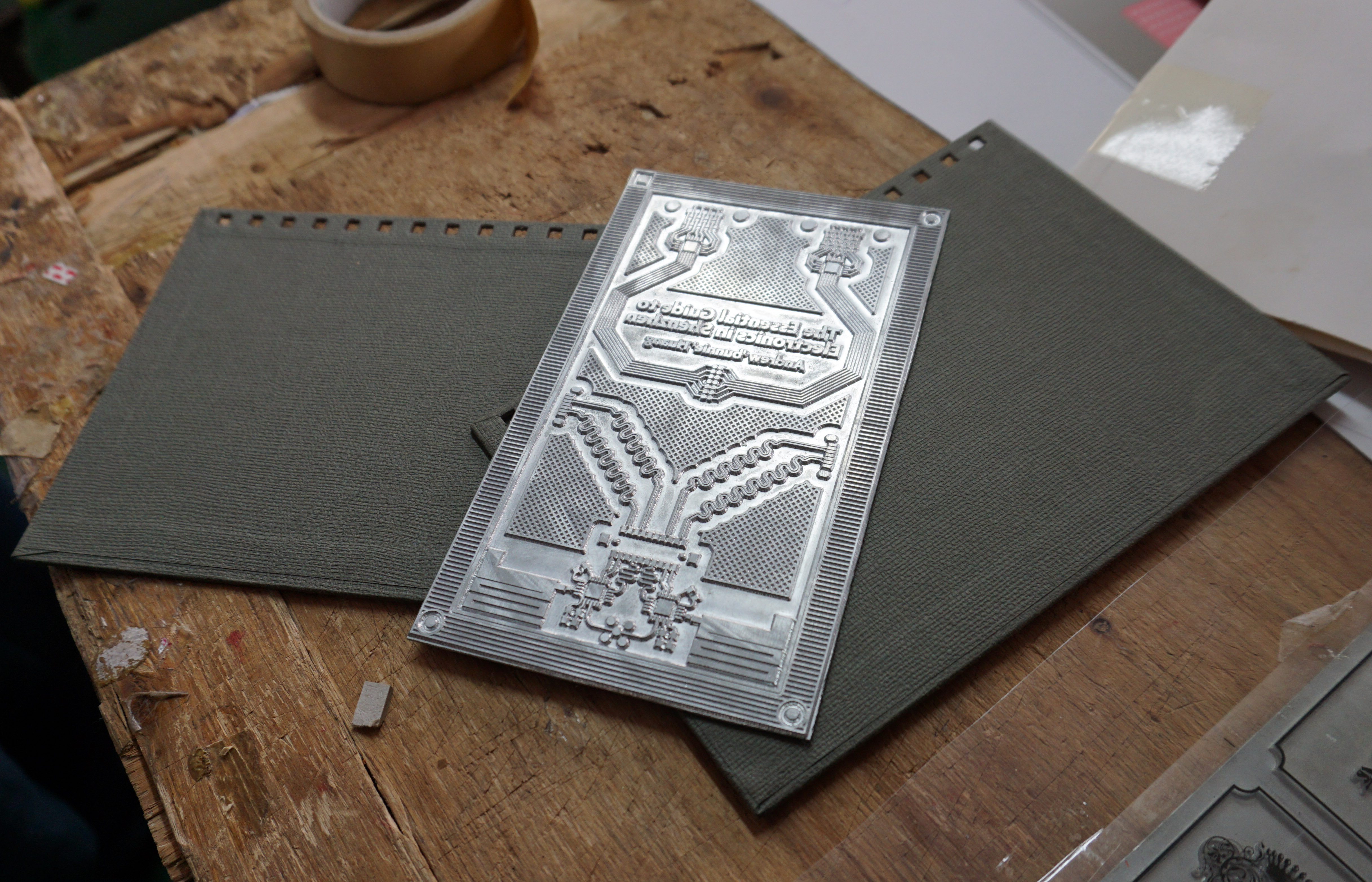
Here, an aluminum plate is first made with the deboss pattern. It looks pretty neat — I’ve half a mind to ask the laoban if he’d save the used plates for me to keep as a souvenir, although the last thing I need in my tiny flat in Singapore is more junk.
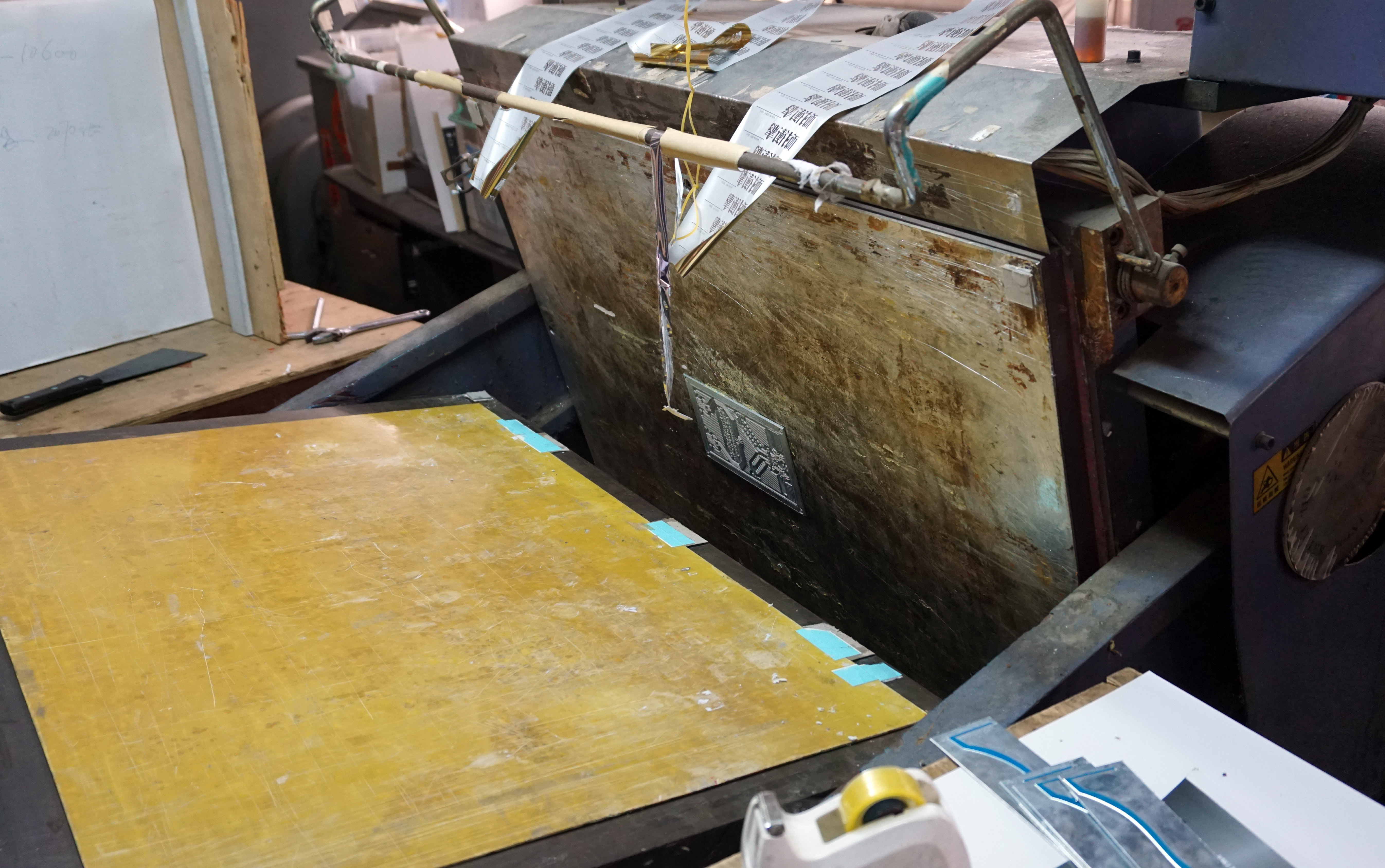
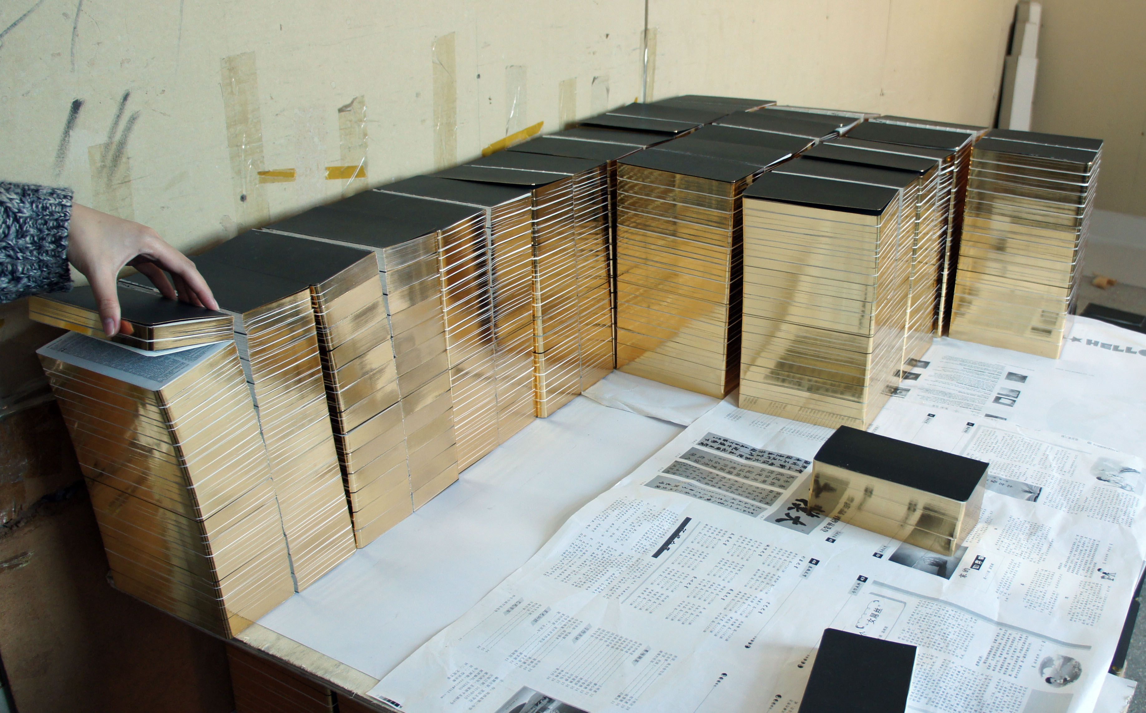
The plate is then glued into a huge press. This versatile machine can do debossing, die cutting, and gilding on sheets of paper as large as A0. For the gilding operation, the mounting face for the aluminum plate is heated to around 130 degrees Celsius.
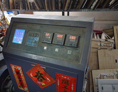
I think it’s kind of cute how they put good luck seals all over the machines. The characters say “kai gong da ji” which literally translated means “start operation, big luck”. I don’t know what’s the underlying reason — maybe it’s to wish good luck on the machine, the factory, or the operator; or maybe fix its feng shui, or some kind of voodoo to keep the darned thing from breaking down again. I’ll have to remember to ask what’s the reason for the sticker next time I visit.
Once at temperature, the gilding foil is drawn over the plate, and the alignment of the plate is determined by doing a test shot onto a transparent plastic sheet. The blank cover is then slid under the sheet, taped in place, and the clear sheet removed.
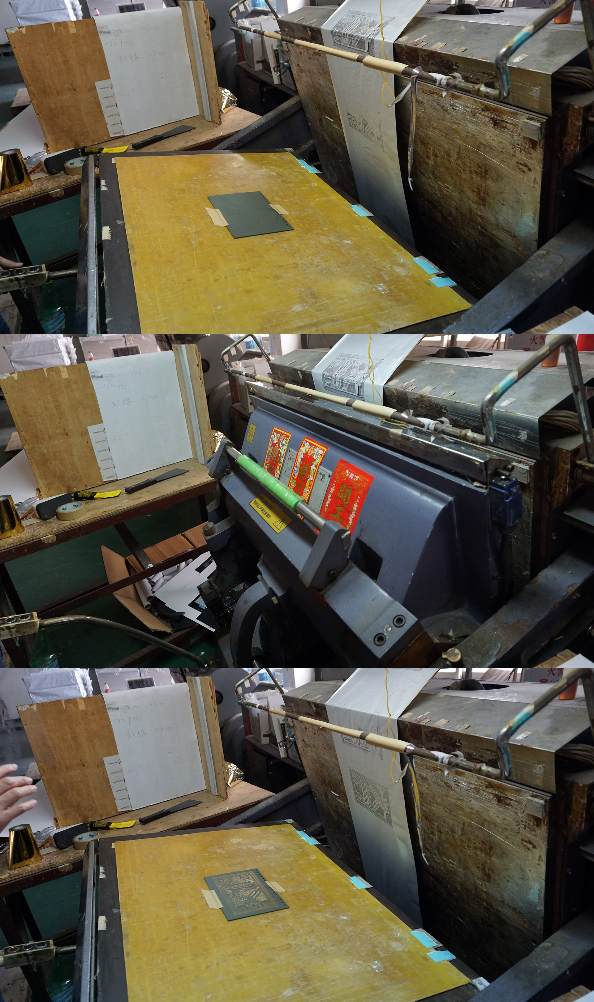
The actual pressing step is very fast — so fast I didn’t have a chance to turn my camera into video mode, so I only have a series of three photos to show the before, pressing, and after states.
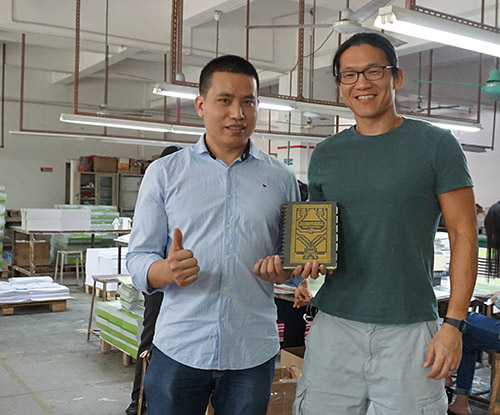
And here’s a photo of me with the factory laoban (boss), showing off the latest prototype. I’ve often said that if you can’t meet the laoban, the factory’s too big for you. Having a direct relationship with the laoban has been helpful for this project; he’s very patiently addressed all my strange customization requests, and as a side bonus he seems to know all the good restaurants in the area so the after-work meals are usually pretty delicious.
I’m looking forward to getting production started on the book, and getting all the pledge rewards delivered on-time. Now’s the last chance to back the crowd funding campaign and get the book at a discounted price. I will order some extra copies of the book, but it’s been hard to estimate demand, so there’s a risk the book could sell out soon after the campaign concludes.

